Drio’s Bo-ho Modern Brand Redesign
Creative Direction / Website Design
Brand Origin Story
Drio is a Baltimore-based, relationship-focused website design and digital marketing company that has successfully worked with small and local businesses to help make their brand the obvious choice. Drio has designed websites and created digital marketing strategies since 2011.
Industry:
Marketing/Advertising and Design
Quest:
Hazel and Rachel, the duo at Drio offered the opportunity to refresh their brand identity and website as they celebrated their 10-year anniversary.
Roles
Creative Director: Gabriel David Carter
Brand Identity Designer: Maggie Humphries
Web Designers: Gabriel David Carter, Maggie Humphries
My Tasks/Deliverables
Brand Research and Discovery
Website Design
Brand Research
Drio took part in a Brand Clarity Workshop I designed to gather vital insights for the brand refresh. It started with Eden, a brand questionnaire I use to collect information and spark ideas around a brand’s ideal and authentic expression. This information is shared with all team members to provide foundational brand clarity, allowing creative inspirations to flow from a united understanding of the brand.
Discovery
Insights gathered from the branding workshop:
The current website was 5 years old and Drio was looking to evolve/refine its brand copy, photos, and website simultaneously. The name Drio was important for brand recognition and would remain the same.
Drio was described as classic and casual with a mature youthfulness
The Drio brand is relaxed and approachable, seeking to connect with others, and attract the clients they align with
The ideal branding is warm and inviting, art deco and minimalistic in aesthetic, appealing to an audience ages 35-54
Drio’s Brand Archetype = The Everyday Individual
Branding Refresh: Drio’s Brand Identity Redesign
Logo Design
The original Drio logo contained a pair of dots above the i, which established a sense of movement and connection. The logo was slim, modern, and presented in lowercase letters creating a sense of youthfulness. This double dot element and the lowercase letters were crafted into the final logo redesign.
The new logo consists of bold and heavy graphical letter shapes. This gives the name a commanding presence. The subtle color change between the two dots, one floating as the roll of the r and the other perfectly balanced upon the stem of the i, feels like a transition to the right place — to the obvious choice as Drio would put it — where you’re meant to be.
The playful curves on the bowl of the d and the stem of the r create a soft flowing movement guiding the viewer’s eye across the logo, floating the gaze over the stems of the d and the i, and slipping through the narrow counter in the o at the end of the logo. Even with bold letter shapes, there is an inviting warmth to the logo, like the presence of a cool and caring older sister.
Primary logo and variations
Logo Before
Logo After
Color Palette


Inspired by architectural and interior design, I often compare the brand development process to that of building your dream home. Maggie, being the highly skilled and observant designer she is, picked up on this and designed Drio’s color palette around various interior design concepts until we arrived at the final color palette, a cozy yet sophisticated arrangement of natural hues.
Brand Pattern
Unique iconography in an art deco aesthetic was created using the dots from the r and the i, plus the rounded bowl of the d. It was then used to create a seamless repeating brand pattern, adding texture to the brand identity.
Website Design
Website Design Iteration 1


For iteration two of the website design, I explored blurring the borders between content sections, reducing the traditional grid layout, and increasing an inviting sense of flow. This flow would be guided and maintained using “hooks”, areas designed to pull the eye below the fold of each scroll.
Iteration 2 Website Wireframe
For iteration two of the website design, I played with the graphical shapes of the letters to create visual interest. I used asymmetry, the use of negative space, shape, color, and texture to move the eye across the screen with each scroll, while the text floats between the heavy shapes, cradled in the middle or alternating sides to keep the viwer’s eyes moving in a natural rhythm.
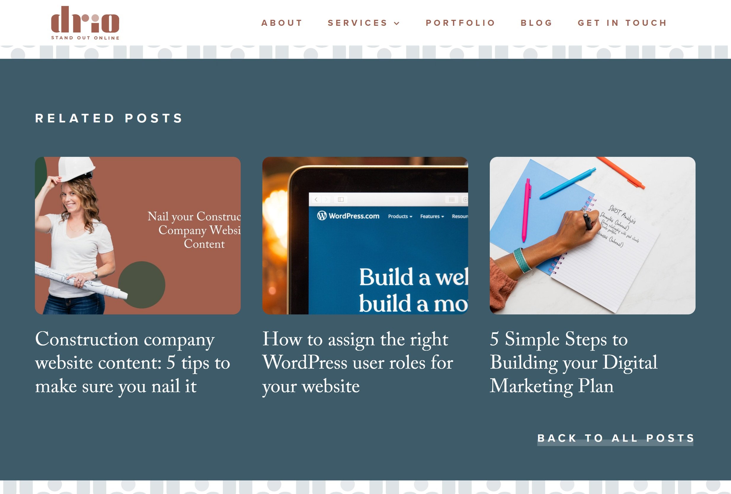
After


Before


Brand Design System and Brand Dashboard
I designed the final website using Figma and provided the clients with a design system and brand dashboard. The design system allows them to continue crafting a seamless experience across their designs. The brand dashboard, built using Milanote, provides a digital house for all brand information and assets.
Summary
As creative director and web designer, I led Drio through a brand redesign for its 10-year anniversary. The new branding is classic yet casual with a mature youthfulness. The final design has an art deco style with warm natural hues and bold lettering. A sense of flow is retained throughout the logo design and website using curved soft edges and asymmetrical design. This project was a joy to work on, I think future iterations could explore more animations, however, this design is brought to life by bold shapes, soft curves, and the texture created by the brand pattern, paired with bight-friendly imagery of Drio’s dynamite duo.


